All in the Family
Capers can be the flavorful, immature flower buds used to enhance soups, sauces and salads; or misadventures like those of Lucy and Ethel. There are two completely different meanings for the same word. In much the same way, the two locations of Capers, the Seattle-based gift shop, are as different as can be.
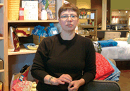 Lisa Myers opened her first Capers store 18 years ago in West Seattle. That store has morphed from a shop selling kitchen goods to a 7,000-square-foot gift shop with a cafe. Although West Seattle is Seattle’s largest neighborhood and its birthplace, it is not the heart of the city. Many Seattleites rarely brave the traffic or the huge bridge that connects them with West Seattle. “West Seattle is a small town unto its own,” Myers says.
When the West Seattle building where Myers leases space was sold a few years ago, she wasn’t sure whether the new owners planned to tear down the strip of businesses, so she started looking for a new location. Crosstown exposure also appealed to Myers. As it turned out, Myers found a 10,000-square-foot building, that once housed a co-op organic grocery store, in the Fremont neighborhood of Seattle. Near the University of Washington, Fremont is home to many college students and is often referred to as the bohemian district north of Seattle. A potential increase in sales and a new customer base seemed to be valid reasons for opening the Fremont store in November 2004. In the end, Capers was allowed to retain its leased space in West Seattle, and Myers kept both stores. Today each caters to its own clientele, and each retains its own style.
Fremont larger, more playful
Myers says opening the Fremont store was almost like opening a new company. “The merchandise is 80 percent the same in the two stores, but they each have a totally different feel,” she says.
The Fremont store, with its high ceilings, is the larger of the two, although much of it is backroom space.
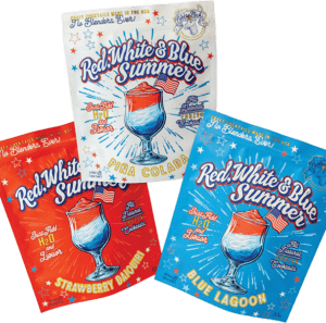
Both stores carry lots of books (Myers loves to read), candles, bath-and-body-careproducts, dinnerware, kitchen gadgets, bar supplies, furniture and gifts for every occasion. “Customers shop at Capers because we stock different items they won’t see anywhere else, and we offer ideas on how to use those items. Customers come here to buy because we offer good design with a nice price point,” Myers says.
When longtime patrons of the West Seattle store visit Fremont, they are startled to find that it doesn’t have a cafe. Myers noticed that many customers in the West Seattle Capers dined in the cafe but never ventured into the gift shop. She learned from that experience and decided against a cafe in her Fremont store. Besides, with lots of good coffee shops and excellent restaurants close by, Myers figured the decision was a sound one to make.
The loading dock in the Fremont store is a real plus for business. “Nobody is dropping off a huge container in the front of the store and expecting it to be unloaded in a couple of hours when they return,” says Myers. The parking lot alongside the store also enhanced this location’s appeal, an important asset in a congested area.
Color me different
 Physically, the two Capers stores are different enough. But what has really caught Myers’ eye is the difference in the stores’ clientele. The Fremont store attracts a younger, more transient audience. For the most part, people who live in West Seattle are there to stay.
To use this difference to the stores’ advantage, Myers decided to attract the two sets of audiences through judicious use of color.
Myers chose to have the Fremont store appeal to the young audience with brightly colored walls to complement the bright, cheery merchandise—giving the Fremont store a more playful feel. The West Seattle store has more muted colors.
In the Fremont store, a 2-foot band of olive green winds around the upper perimeter, with the wall panels below painted in a variety of fun, vibrant colors. Behind the wrap desk, the pumpkin-colored wall makes it easy to find the cashier. Light peacock blue, chocolate brown, stunning coral and pale yellow adorn other wall panels.
Color is played out through the bright displays visible through the window. Even before you enter the store, you can read Capers’ colorful, graphic-filled newsletter on the glass.
Serious in West Seattle
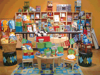
 Capers’ Fremont store, shown above, has more vibrant wall colors to attract a younger clientele.
The more muted wall colors in the West Seattle location, shown below, are in keeping with the more well-established professional community that shop serves.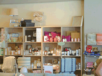
The darker, muted colors in West Seattle give the original store a more serious ambience, which fits with the well-established community. Last summer, the walls were coated with Devine paint, a Miller Paint Co. product that is specially formulated for the soft sunlight in the Pacific Northwest.All wall colors are changed frequently in the West Seattle store. The last time Myers did so was last summer.
For the Fremont store, Myers admits to picking colors she thought would look good, within 10 minutes. The entire Fremont store came together in six weeks, from planning the layout to the design to store opening. “The designer threw out a deck of colors and I decided what I wanted, including the accent walls. Originally I thought we’d be changing the colors frequently like we do in West Seattle, but now I don’t think that’s necessary. This store looks good,” Myers says.
Through effective use of color, Capers offers each of its neighborhoods what that area wants and has come to expect. In Fremont there are splashes of bright, vivid color that create a lively ambience, and in West Seattle the store has calmer colors that change frequently and create a more serene setting.
Color down to the details
Capers also makes use of color in its packaging. Most items are wrapped with pistachio green tissue, then covered with clear cello wrap and tied at either end with brown, black or wisteria ribbon. The packages almost look like Tootsie Rolls. For books or boxes, Myers likes to use the same pistachio-colored wrap and make an interesting fold that creates a ribbon-like look. Myers enjoys gift-wrapping and has made it one of her store’s signatures.
“You need to have flair,” Myers says. “What you do doesn’t have to be flashy, but it needs to be consistent. We used to change the tissue color, but now we don’t. The Capers label goes on everything that leaves here, so the gift recipient knows who we are.”
“I think people respond to color. When they like the space, are comfortable and it makes them feel good, they are more likely to buy,” Myers says.