Color Sells
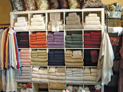 Subtle touches speak volumes! Notice the strategically placed sand-colored towel set at the top. It acts as a great complement to the white and sand mixes in the entire row.
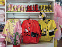 Boots that match the raincoats are placed in columns making this display a perfect example of vertical integration with color. The effective placement of red in the middle offsets both the subtler pink and the primary yellow, beautifully.
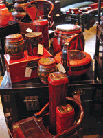 One color need not come from one kind of product alone. Here a deep mahogany color is showcased spectacularly across a wide variety of products. Setting them against furniture with the same rich tones makes for an even bigger impact!
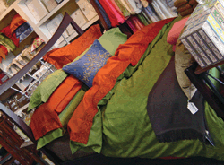 Take one chicory-colored throw. Drape it across a mahogany bed; surround with colored bed linens that work with each other. Voila! You’ve got a perfect recipe for an “I’ll-take-it-like-that” display. The unexpected blue pillow lightens up the tone and guides the eye to other blue-colored products in the store.
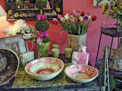 Got a brightly colored wall in your store? Why not use it to your advantage? Here the store’s pink wall is showcased by the pink merchandise displayed alongside. The green tones throughout ensure the display doesn’t get overwhelming or monotonous.
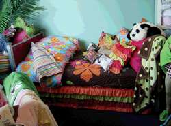 Wow! Colors and shapes in perfect harmony. Mocha, aqua, orange; all work with polka dots, stripes and flowers to create a display any preteen (and her parent!) would swoon over.


