Pantones Leatrice Eiseman Shares Color Trends and Design Impact
Las Vegas – Pantone, Inc. Executive Director Leatrice Eiseman presented a forecast of color trends during the Winter 2008 Las Vegas Market this week. She previewed what she called one of the most directional furniture palettes in the ever-evolving home furnishings palette.
Presented by Furniture Style, there is not one hot color of the year. Consumers today have dramatically different lifestyles and look for inspiration in design, color and style.”Style is not a four letter word,” she said, referring to generous, inventive and highly stylized use of color on everything from chairs to kitchenware. “In real estate it’s all about location, location. In color it’s context, context,” she said.
Television decorating shows and even movies raising the expectations of consumers regarding colors. “Color makes the biggest impact and gets the eye to pay attention.” Eiseman showed images of the movie Shrek and pointed out the emergence of green and brown hues in home furnishings.
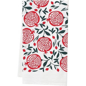
Fashion and global trends are also strong precursor to what will show up on home furnishings. Celebrity Bono’s red social action campaign took the color beyond trend and influenced Pantone’s chili pepper red. Environmental issues area also spurring green beyond a color trend. Blue is the most popular color with consumers and crosses over into many home decorating areas in shades of pinks and purples.Forecasters are saying that yellow is the new orange, but Eiseman said while yellow is making inroads into the color palette, orange will not go away, at least for the next couple of years. Many shades of green are prominent and are beyond a color trend
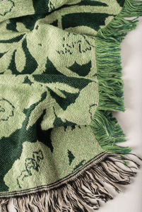
Brown is hot, changing from dirty to rich and robust, in what Eiseman calls the Starbucks phenomenon. Browns are also being paired with other colors in edgy ways, like brown and fuchsia. Black remains hot and there has been a big return to gray. Adaptation of animal prints will continue on in vogue.
Metallics are hanging on longer than many in the industry would have expected, Eiseman said. Finishes have been reworked so it’s not just a bright gold or silver but patinas. Metallics, too, are showing up in many furnishings, with technology and advances in fabrics as the great enabler. She showed an example of a chaise she spotted at the Milan furniture fair that she expected to be cold and sterile but actually felt like taffeta. Whimsical uses of color and over-the-top designs attract attention on the selling floor.
According to Eiseman, a major challenge in today’s marketplace is satisfying consumers’ or clients more demanding perceived needs and desires in both styling and color. They are looking beyond a simple matching process to colors they can instantly ‘connect’ with, suit their personal comfort level and excite the imagination. At the same time, there is the practical need to connect to products or settings they already own. As always, it is the introduction of new or renewed themes and colors or unique combinations that will create these essential connections.To cap off her talk, Eiseman reviewed the hot colors of the year in the PANTONE 2008 color forecast.
ReCollections
New color mixes called “ReCollections” provide a link to the past, while at the same time beckoning to the collectibles of the future. Enhanced by tapestry blues and muted blue greens, elegant champagne and warm peachy tones are pivotal to this palette. History invariably repeats itself, but there are interesting new adaptations that energize customary traditional themes, largely provided by new color mixes and materials.
High Profile
High Profile hues are a sexy, contemporary palette, inspired by the stylish icons that have managed to survive the fads and foibles of the past. Often combining techno with retro or mystical with modern, designs are sleek, trim and forever contemporary. These aspirational products (or settings) are newly invented in classic shades of pristine white, ebony black, rich browns, or silvery grays accented by the glamorous impact of fuchsia, royal purple as well as glimmering gold and silver.
Ethnic Chic
Ethnic Chic reaches a new level of sophistication in rich hues of deep purple paired with misted yellow and stone grays, while burnt orange is juxtaposed against vibrant blue and brunette browns.The ethnic chic look has gone uptown and upscale. A brown and purplish combo will be a hot look into 2009. With a plethora of design influences coming from anywhere on the globe, it is possible for “urban nomads” to wander the world (virtually or digitally) looking for the styling and color language of another culture that speaks to them.
Chinoiserie
Defined as a style of ornate art or decoration suggesting the Chinese tradition, Chinoiserie is a blend of graceful shapes and charming motifs. Colors are artfully combined in tones of quiet violet with muted lime, cameo pink and hushed greens with a traditional touch of an antiqued Chinese red. With the Olympics coming up in Bejing, there is an increased interest in Chinese culture. It is a glimpse of China’s stylized past preserved in porcelain, ceramics, paintings and silky textiles.
Agrestic
Rooted in rural origins, the Agrestic palette reflects the culture of individually crafted materials that are going more in the direction of upscale than down-home. It is appealingly contemporized country, a rustic re-do of both texturized and smooth surfaces that calls for comforting combinations, for example, of bruschetta browns, tender greens, or warming golden yellows with an unexpected accent of a vibrant pink. In fact, Eiseman said major retailers are embracing pink as well. Neiman Marcus recently ran a pink sale in lieu of a white sale.
Wellspring
Universally understood as cleansing and clarifying and as the earth’s most precious commodity, water provides the Wellspring that literally supports and sustains life. It’s not only about green when it comes to eco-awareness. Blues and aquas clearly define the liquid’s cooling and more soothing qualities, highlighted by a glimmer of effervescent undersea green, violet and indigo. The undulating tones of mother of pearl and sandy shades of the shore bring a beautifully warming balance. Blue is still the leader of the pack and a consumer favorite, lending a sense of stability. Blue Iris, a magical shade with hints of purple, was recently pegged as Pantone’s color of the year and will continue on in prominence until at least 2010.
Savories
In a world filled with stress, schedules, commitments and concerns, it is important to have some unadulterated fun in at least one area of living space—to savor a more fanciful “time out” filled or accented with deliciously exuberant, youthful and whimsical hues. The Savories palette includes tasty blends of decadent chocolate and daiquiri green, with dollops of appetizing brights embellishing the mix. These hot colors are not just for kids. Everything from sinks to furniture are sporting these hot hues.
Nuances
In the world of home furnishings, there is always a need for neutrals—the classic, nature inspired hues that can always be depended upon as background (or foreground). These newly “nuanced” neutrals can also provide a visual pathway to unexpected and intriguing accents or combinations such as rose paired with earthy browns or reddish plums highlighted with a green-tinged bronze tone. Today’s mauves are new and fresh. In fact, Calvin Klein is bringing mauve back in a different way.
Eiseman is a color specialist who has been called “America’s color guru.” In fact, her color expertise is recognized worldwide. She has helped many companies make the best and most educated choice of color for product development, logos and identification, brand imaging, web sites, packaging, point of purchase, interior/exterior design or any other application where color choice is critical to the success of the product or environment.
In addition to her post with Pantone, she heads the Eiseman Center for Color Information and Training and is also executive director of the Pantone Color Institute. Eiseman has authored many books on color.
Pantone, Inc. has been the world’s color authority for more than 45 years, providing design professionals with products and services for the colorful exploration and expression of creativity. Always a source for color inspiration, Pantone now offers paint and designer-inspired products and services for consumers. More information is available at pantone.com.
About World Market Center
The Winter 2008 Las Vegas Market runs January 28 through February 1, 2008 at World Market Center’s Buildings A, B and Pavilions with temporary exhibitors at the MGM Grand Hotel starting January 29.
The semi-annual Las Vegas Market is the world’s fastest-growing trade show for home furnishings. When fully built out to 12 million square feet, World Market Center will boast the greatest depth and breadth of furniture-related products and will be the largest trade fair complex in the world.