Color it SOLD
A key component of merchandise presentation, color attracts attention and influences consumer decisions. Effective visual merchandising utilizes color to enhance products and reinforces a store or brand image.
Ombre
 A current trend in fashion and interior décor, the ombre technique is when a color fades from dark to light, or vice versa. For products available in a number of shades or color options, it is a fun and modern way to present them. Other ways to feature this trend in retail is to dip the tips of mannequin wigs, use graduated color fitting room curtain panels or arrange jewelry in a light-to-dark configuration.
Variety Show
 Customers prefer choices. Products that are available in multiple colors should be shown several ways. Especially effective in store windows, multiple colors show the depth and variations of a single line, attracting customers for a closer look. For props and styling, choose a theme that reflects a season or a mood that best represents the image of the store.
Color Family
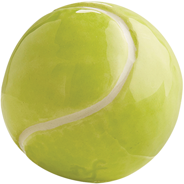
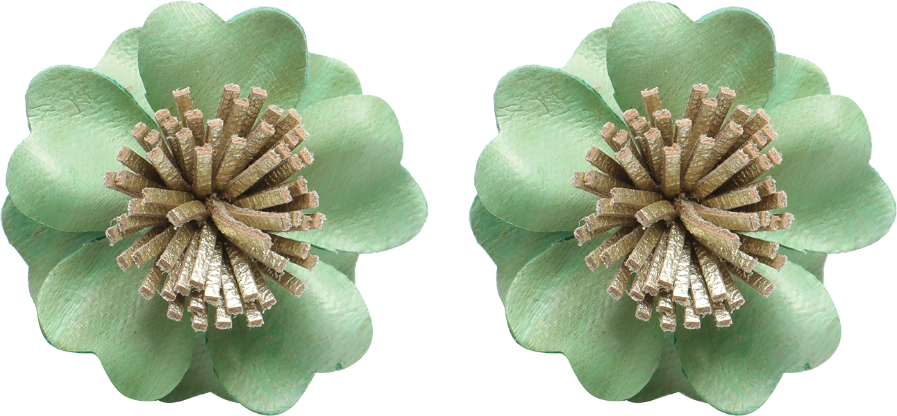
 Whether it’s the color-of-the-year or the color-of-the-season, merchandise arrives in store and a color story emerges. Displays created with merchandise in the same color family attract attention and are especially effective when featuring small products. Monochromatic does not dictate just one color, but includes variations of one hue.
Neutral Territory
 Neutral technically means “without color” and includes shades of beige, ivory, taupe, black, gray, and white. When it comes to display fixtures, it is more important to choose between warm or cool neutrals than to focus on a specific color family. Neutral fixtures – which include brass, chrome and wood tones – have the biggest impact when grouped in clusters of a single color that complements the merchandise on display. As shown here the bright colors of the products stand out against the matte grey fixtures. The fixtures’ varying sizes add visual interest and accommodate multiple shapes and sizes of merchandise.


