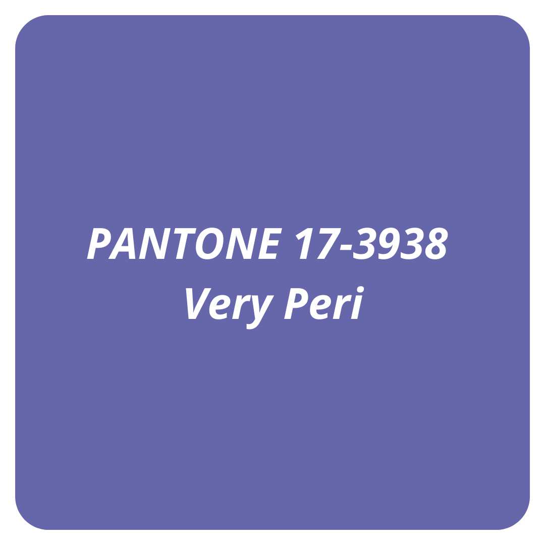
Pantone names PANTONE 17-3938 Very Peri as the Color of the Year
Pantone, the global color authority and provider of professional color language standards and digital solutions for the design community, introduced a new blue shade, PANTONE 17-3938 Very Peri, a dynamic periwinkle blue hue with a vivifying violet red undertone as the Pantone Color of the Year selection for 2022. Blending the faithfulness and constancy of blue with the energy and excitement of red, this happiest and warmest of all the blue hues introduces an empowering mix of newness.
Displaying a carefree confidence and a daring curiosity that animates our creative spirit, inquisitive and intriguing PANTONE 17-3938 Very Peri helps us to embrace this altered landscape of possibilities, opening us up to a new vision as we rewrite our lives. Rekindling gratitude for some of the qualities that blue represents complemented by a new perspective that resonates today, PANTONE 17-3938 Very Peri places the future ahead in a new light.
We are living in transformative times. PANTONE 17-3938 Very Peri is a symbol of the global zeitgeist of the moment and the transition we are going through. As we emerge from an intense period of isolation, our notions and standards are changing, and our physical and digital lives have merged in new ways. Digital design helps us to stretch the limits of reality, opening the door to a dynamic virtual world where we can explore and create new color possibilities. With trends in gaming, the expanding popularity of the metaverse and rising artistic community in the digital space PANTONE 17-3938 Very Peri illustrates the fusion of modern life and how color trends in the digital world are being manifested in the physical world and vice versa.
“As we move into a world of unprecedented change, the selection of PANTONE 17-3938 Very Peri brings a novel perspective and vision of the trusted and beloved blue color family,” said Leatrice Eiseman, executive director, Pantone Color Institute. “Encompassing the qualities of the blues, yet at the same time possessing a violet-red undertone, PANTONE 17-3938 Very Peri displays a spritely, joyous attitude and dynamic presence that encourages courageous creativity and imaginative expression.”
“The Pantone Color of the Year reflects what is taking place in our global culture, expressing what people are looking for that color can hope to answer,” added Laurie Pressman, vice president of the Pantone Color Institute. “Creating a new color for the first time in the history of our Pantone Color of the Year educational color program reflects the global innovation and transformation taking place. As society continues to recognize color as a critical form of communication and as a way to express and affect ideas and emotions and engage and connect, the complexity of this new red-violet-infused blue hue highlights the expansive possibilities that lie before us.”
Pantone 17-3938 Very Peri in Apparel and Fashion Accessories
PANTONE 17-3938 Very Peri, a warm and friendly blue hue with a carefree confidence and joyful attitude, emboldens uninhibited expression and experimentation. Displaying a dynamic presence, Very Peri is an enthusiastic blue hue whose whimsicality lends itself to unpredictable color harmonies and spontaneous color statements. Futuristic in feeling, PANTONE 17-3938 Very Peri takes on distinct appearances through application to different materials, finishes and textures, from shimmery metallics, lustrous sheens and high-tech materials to handcrafted looks and natural fibers.
Pantone 17-3938 Very Peri in Beauty and Hair
Suggestive of personal inventiveness and daring imagination, PANTONE 17-3938 Very Peri makes a novel statement for eyes, nails and especially in hair in a variety of finishes and applications from glittery and glam to dusty matte.
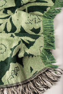
Pantone 17-3938 Very Peri in Home Décor and Interior Design
Evocative of new modernity, PANTONE 17-3938 Very Peri injects a sense of playful freshness into home interiors, enlivening a space through unusual color combinations. A versatile shade that animates our creative spirit, PANTONE 17-3938 Very Peri is suited to an array of different materials, textures and finishes, providing a pop of color, whether introduced through a painted wall, accent furniture or home décor, or acting as an intriguing and eye-catching accent in a pattern.
Pantone 17-3938 Very Peri in Packaging and Multimedia Design
Fusing together the undertones of the constancy and continuity of blue with the energy and excitement of red, PANTONE 17-3938 Very Peri, conveys a message of credibility as well as creativity. Whether appearing in a fantasy digital realm or in physical materials, PANTONE 17-3938 Very Peri exudes a good-natured warmth that quickly engages the eye, making it an ideal shade for many applications of graphic and multimedia design as well as packaging.
Design with Pantone 17-3938 Very Peri
Very Peri is paired with versatile hues in a series of four palettes, available to designers as inspiration to incorporate into designs via the Pantone Connect digital color platform. Pantone Connect is available as a mobile app and on the web, and as an extension app for Adobe® Creative Cloud® to make capturing, curating, and designing with Pantone Color easy and accessible. A featured Color of the Year page has all relevant color information for using Very Peri across various physical and digital design media. Visit pantone.com/connect.
MICROSOFT X PANTONE COLOR OF THE YEAR
Highlighting the power of color in digital design, Pantone teamed up with Microsoft to bring the PANTONE Color of the Year 2022 to life in across Microsoft products – including custom Teams backgrounds, Windows wallpapers, a new Edge theme, and a PowerPoint template infused with Very Peri. Microsoft understands the critical role color plays in our digital lives, especially given our increased reliance on digital tools for communication amid a hybrid landscape.
ARTECHOUSE X PANTONE COLOR OF THE YEAR
A pioneer in the field of experiential art, ARTECHOUSE creates and produces innovative technology driven exhibitions, expanding the possibilities of art and how we experience it. Inspired by the transformational nature and inventiveness of PANTONE 17-3938 Very Peri, Pantone partnered with ARTECHOUSE and their creative team to produce a visually and audibly compelling immersive digital experience incorporating rich textures and images of the Color to celebrate the unveiling in an innovative way for the 21st century audience. ARTECHOUSE New York space, located in a 100-year-old boiler room beneath the Chelsea Market, will serve as the backdrop of our official Color of the Year 2022 announcement to media and influencers across design and creative industries. ARTECHOUSE will further immerse people in the colors by opening an exhibition of the color to the public in 2022.
TEZOS X PANTONE COLOR OF THE YEAR
With the help of Tezos, the energy-efficient blockchain network, Pantone will begin to explore the world of color in the digital art world for Color of the Year 2022. Collaborating with Paris-based multidisciplinary artist, Polygon1993, Pantone and Tezos will leverage these artworks inspired by PANTONE 17-3938 Very Peri to create a digital representation of the color and the message that the color embodies – inventiveness, creativity and new ways of thinking about color. For more information, please visit www.tezos.com.
About the Pantone Color of the Year
The Color of the Year selection process requires thoughtful consideration and trend analysis. To arrive at the selection each year, Pantone’s color experts at the Pantone Color Institute comb the world looking for new color influences. This can include the entertainment industry and films in production, traveling art collections and new artists, fashion, all areas of design, popular travel destinations, as well as new lifestyles, playstyles, and socio-economic conditions. Influences may also stem from new technologies, materials, textures, and effects that impact color, relevant social media platforms and even up-coming sporting events that capture worldwide attention. For 23 years , Pantone’s Color of the Year has influenced product development and purchasing decisions in multiple industries, including fashion, home furnishings, and industrial design, as well as product packaging and graphic design.
Past selections for Color of the Year include:
- PANTONE 17-5104 Ultimate Gray and PANTONE 13-0647 Illuminating (2021)
- PANTONE 19-4052 Classic Blue (2020)
- PANTONE 16-1546 Living Coral (2019)
- PANTONE 18-3838 Ultra Violet (2018)
- PANTONE 15-0343 Greenery (2017)
- PANTONE 15-3919 Serenity and PANTONE 13-1520 Rose Quartz (2016)
- PANTONE 18-1438 Marsala (2015)
- PANTONE 18-3224 Radiant Orchid (2014)
- PANTONE 17-5641 Emerald (2013)
- PANTONE 17-1463 Tangerine Tango (2012)
- PANTONE 18-2120 Honeysuckle (2011)
- PANTONE 15-5519 Turquoise (2010)
- PANTONE 14-0848 Mimosa (2009)
- PANTONE 18-3943 Blue Iris (2008)
- PANTONE 19-1557 Chili Pepper (2007)
- PANTONE 13-1106 Sand Dollar (2006)
- PANTONE 15-5217 Blue Turquoise (2005)
- PANTONE 17-1456 Tigerlily (2004)
- PANTONE 14-4811 Aqua Sky (2003)
- PANTONE 19-1664 True Red (2002)
- PANTONE 17-2031 Fuchsia Rose (2001)
- PANTONE 15-4020 Cerulean (2000)
Very Peri, the color selected as our Pantone Color of the Year 2022 will be added into the Pantone Fashion, Home + Interiors Color System, the most widely used and recognized color standards system for fashion, textile, home, and interior design.
For more information on the Pantone Color of the Year for 2022, please visit https://www.pantone.com.
About The Pantone Color Institute™
The Pantone Color Institute is the business unit within Pantone that highlights the top seasonal runway colors, selects the Pantone Color of the Year, forecasts global color trends, and advises companies on color for product and brand visual identity. Through seasonal trend forecasts, color psychology, and color consulting, the Pantone Color Institute partners with global brands to effectively leverage the power, psychology, and emotion of color in their design strategy.
About Pantone
Pantone provides the universal language of color that enables color-critical decisions through every stage of the workflow for brands and manufacturers. More than 10 million designers and producers around the world rely on Pantone products and services to help define, communicate and control color from inspiration to realization – leveraging advanced X-Rite technology to achieve color consistency across various materials and finishes for graphics, fashion and product design. Pantone Standards feature digital and physical color specification and workflow tools. The Pantone Color Institute™ provides customized color standards, brand identity and product color consulting as well as trend forecasting inclusive of Pantone Color of the Year, Fashion Runway Color Trend Reports, color psychology and more. Pantone B2B Licensing incorporates the Pantone Color System into different products and services, enabling licensees to communicate and reproduce certified Pantone values and improve efficiencies for their users. Pantone Lifestyle brings color and design together across apparel, home, and accessories. Learn more at http://www.pantone.com and connect with Pantone on Instagram, Facebook, Pinterest, and LinkedIn.
 News
News